Ever since its debut in Indian market HMD Global has been trying hard to lure in the customers with its engaging brand – Nokia 3.2 is yet another attempt to strike the audience with its impeccable looks and lucrative pricing strategy which seems to be on par with the rivals in this segment. But does this attempt has what it takes to out spec the leaders such as Xiaomi`s Redmi Series or the Samsung M series? Well, let’s find out.
Design
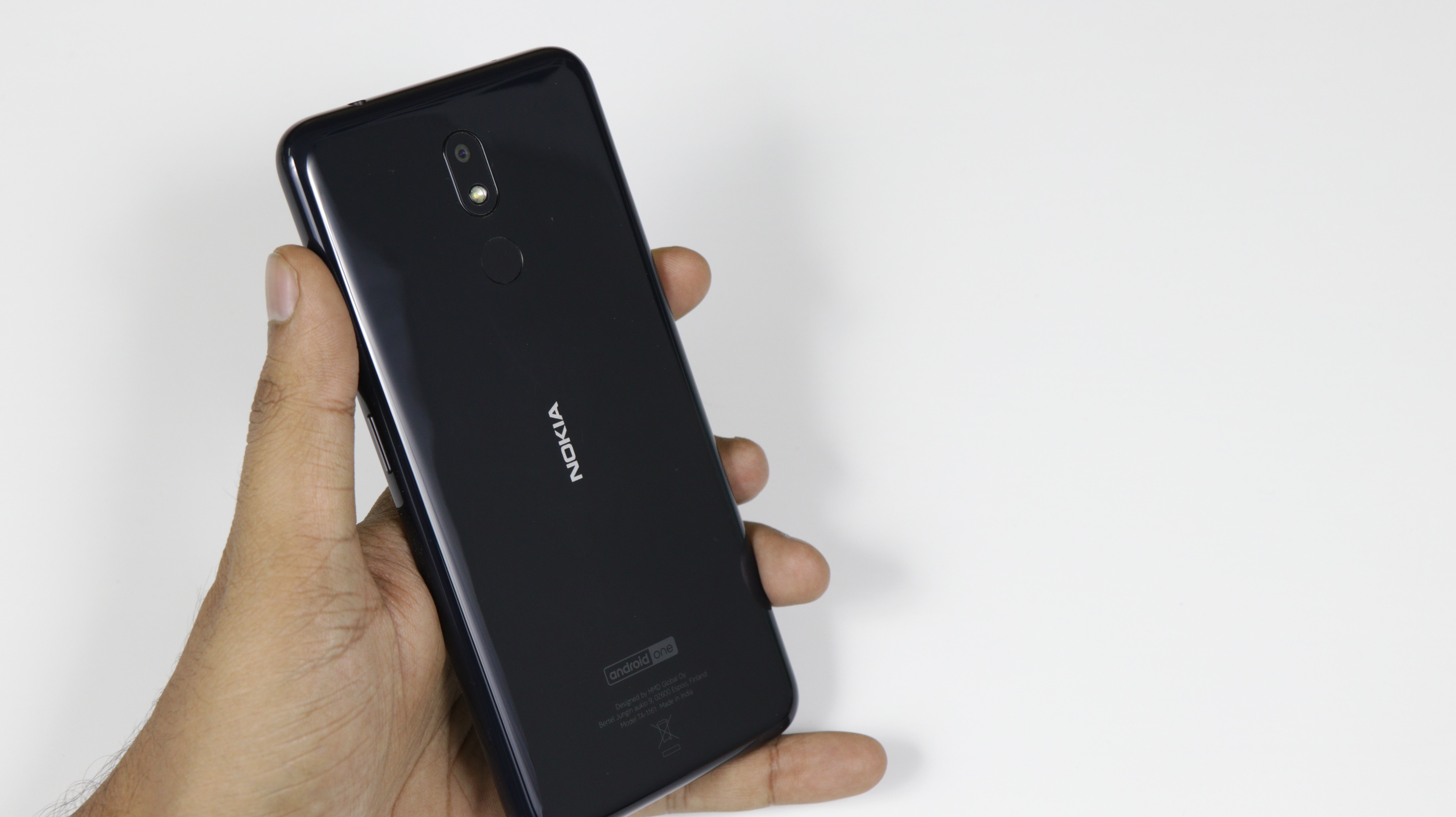
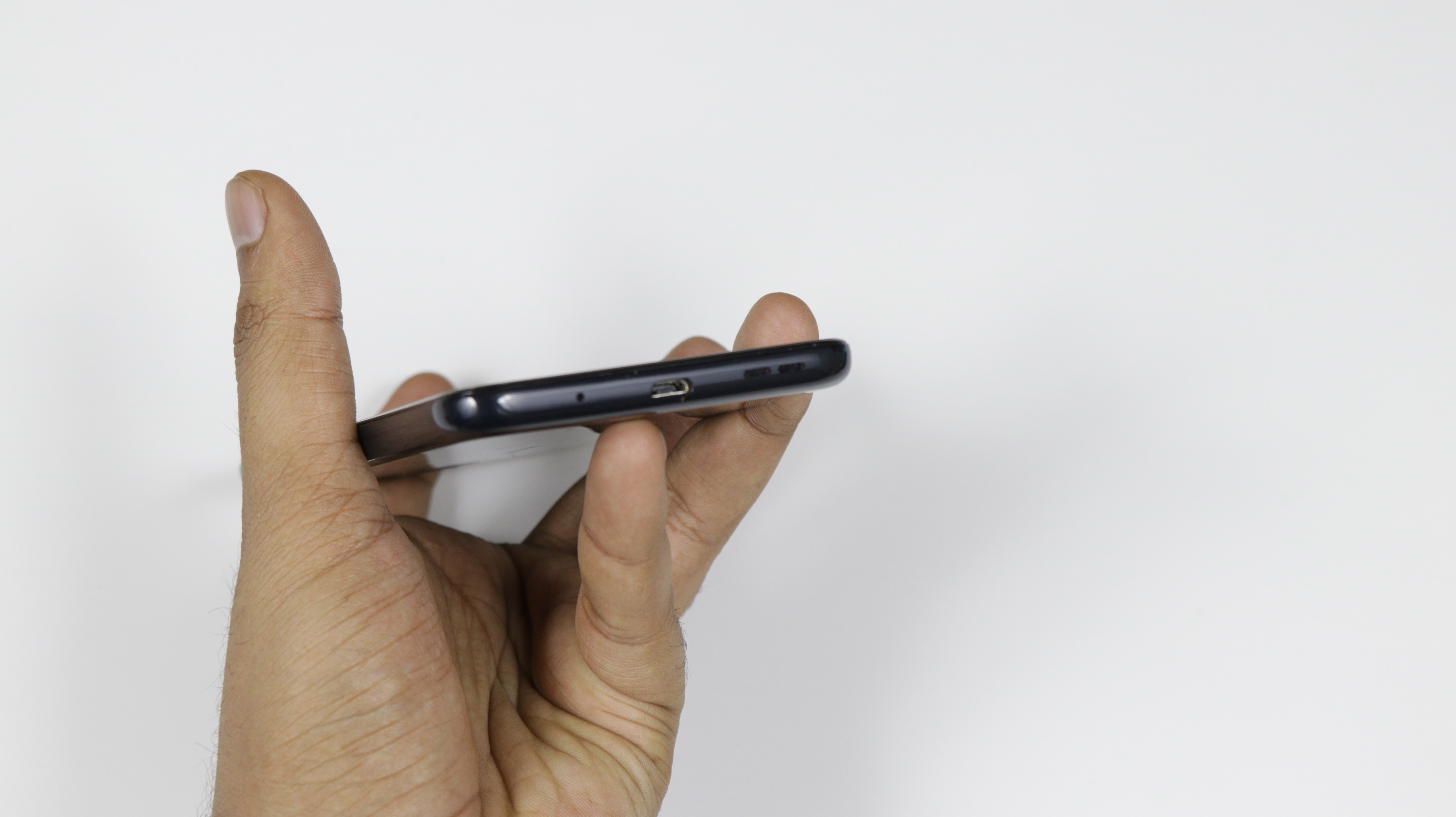
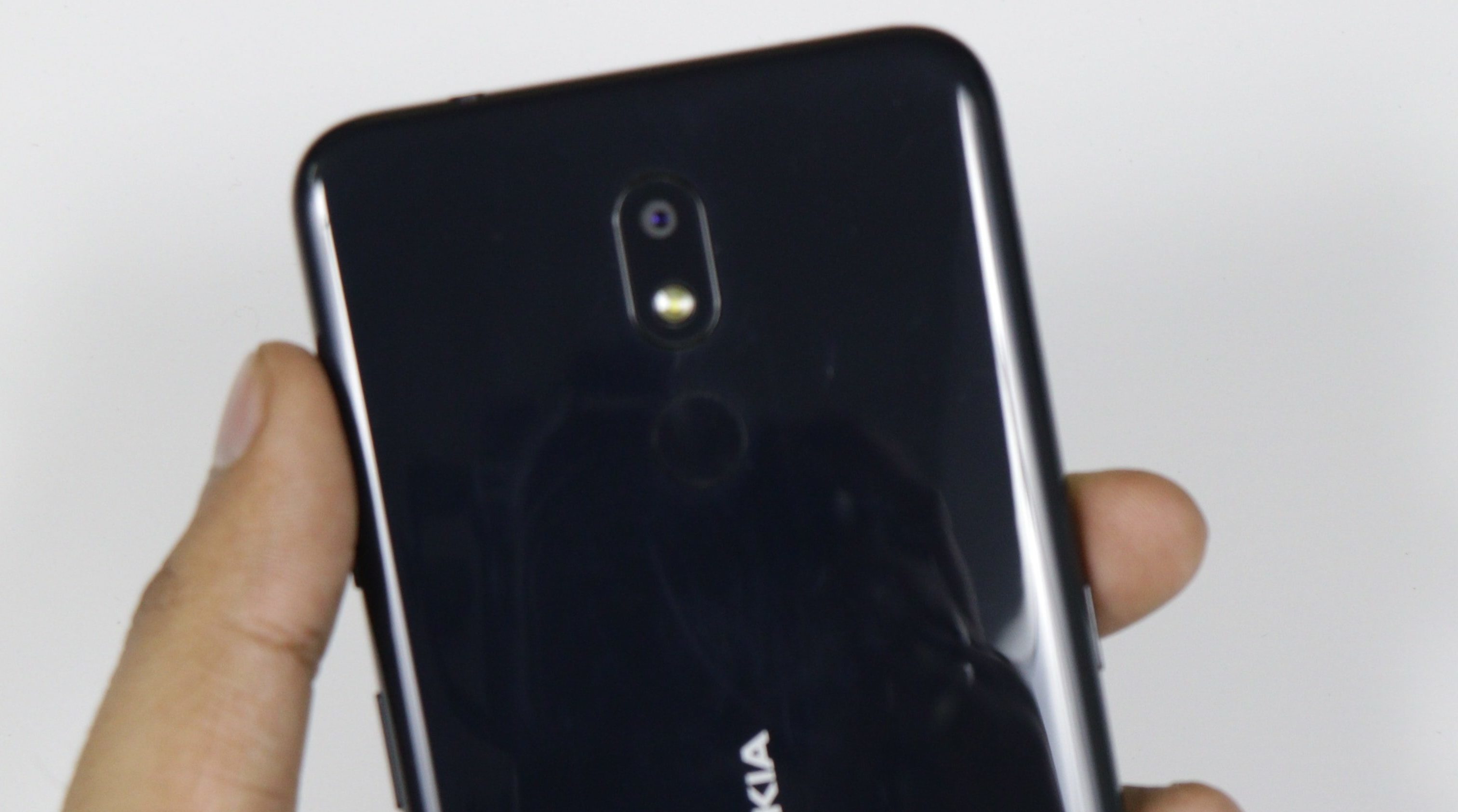
The design of the Nokia 3.2 might just appeal to some folks but seems a little understated for our taste. It’s utilitarian with its curved sides and rounded corners which help it feel ergonomic for its massive dimensions. The back is made out of polycarbonate unibody that extends right itself to the 2.5D curved glass up front.
It attracts a lot of visible dust and fingerprints which we hope to be just an issue on this Black colour variant. We would recommend opting for the steel grey as it would tone out the fingerprint smudges right off the back.
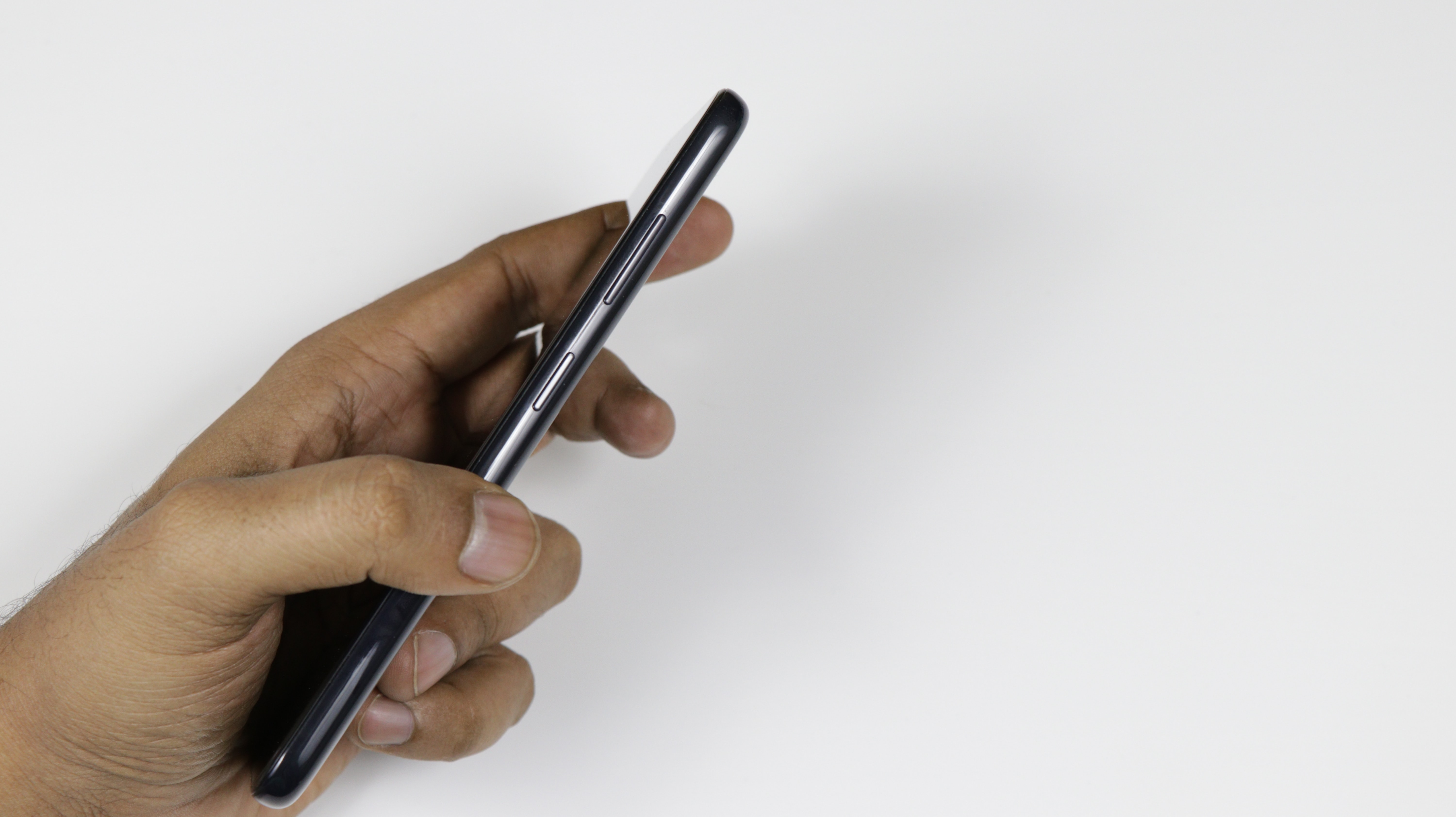
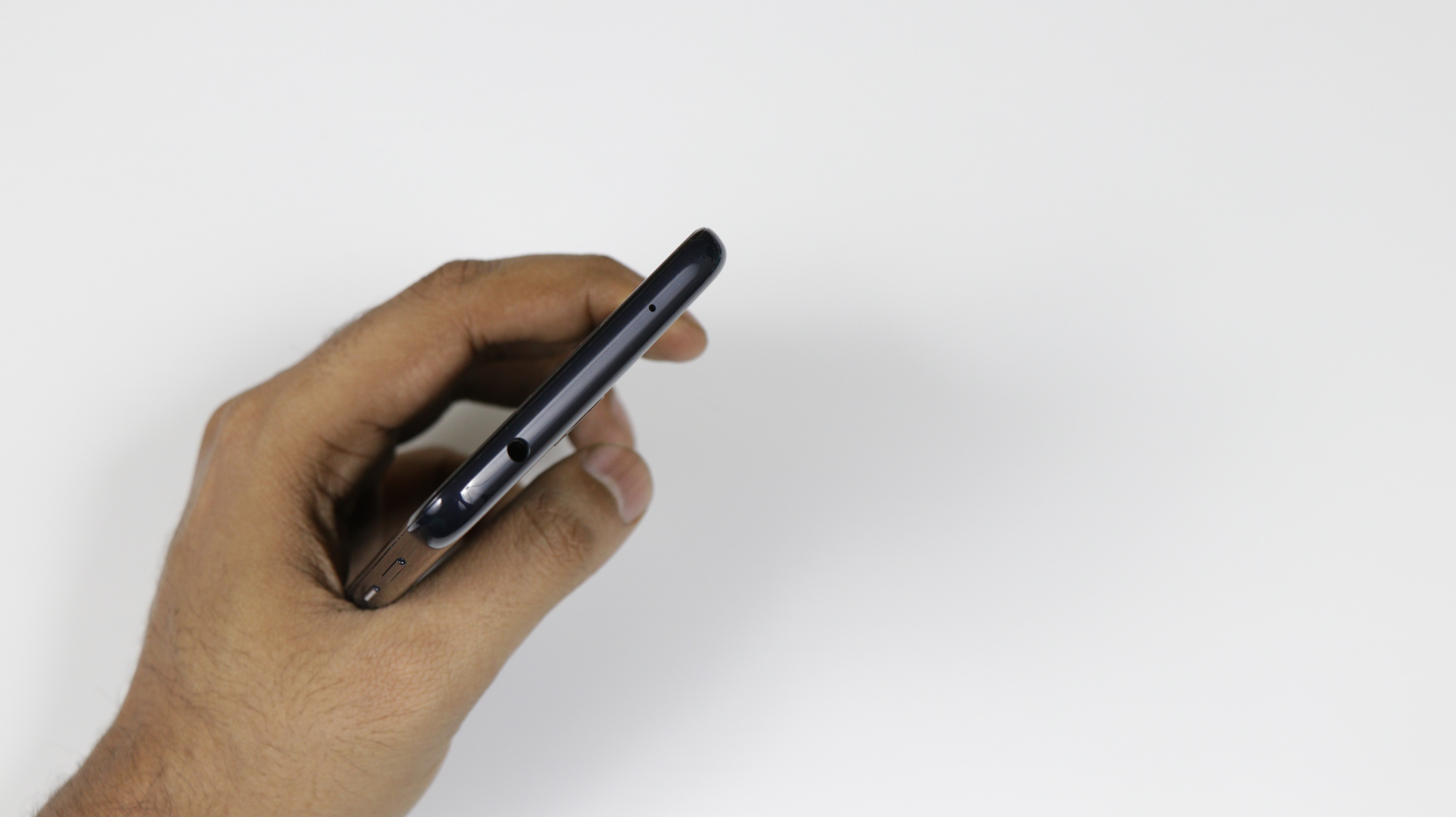
What we like is the right side which houses the volume rocker and a power button which also doubles up as a notification light. The button is surrounded by a ring of light which illuminates in bright white upon receiving messages.
There is also a dedicated Google Assistant Button on the left which is a nifty little feature which we turned out to be quite helpful at times. A single press brings up the Google Assistant, while a double press opens up the google assistant page with recommendations according to user locations and upcoming events or appointments.
Display & Processor
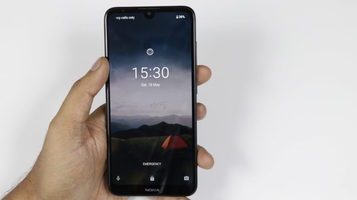
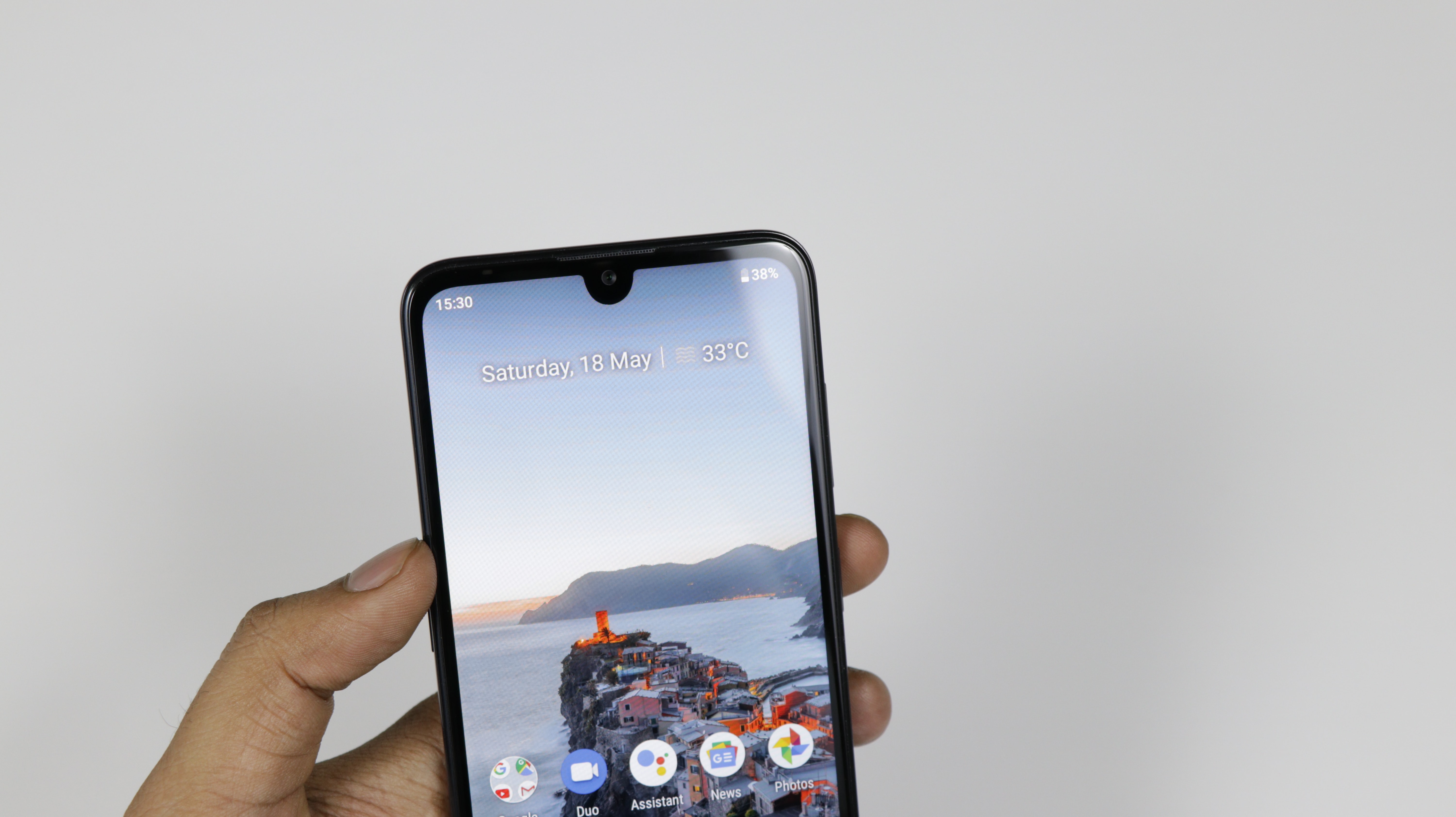
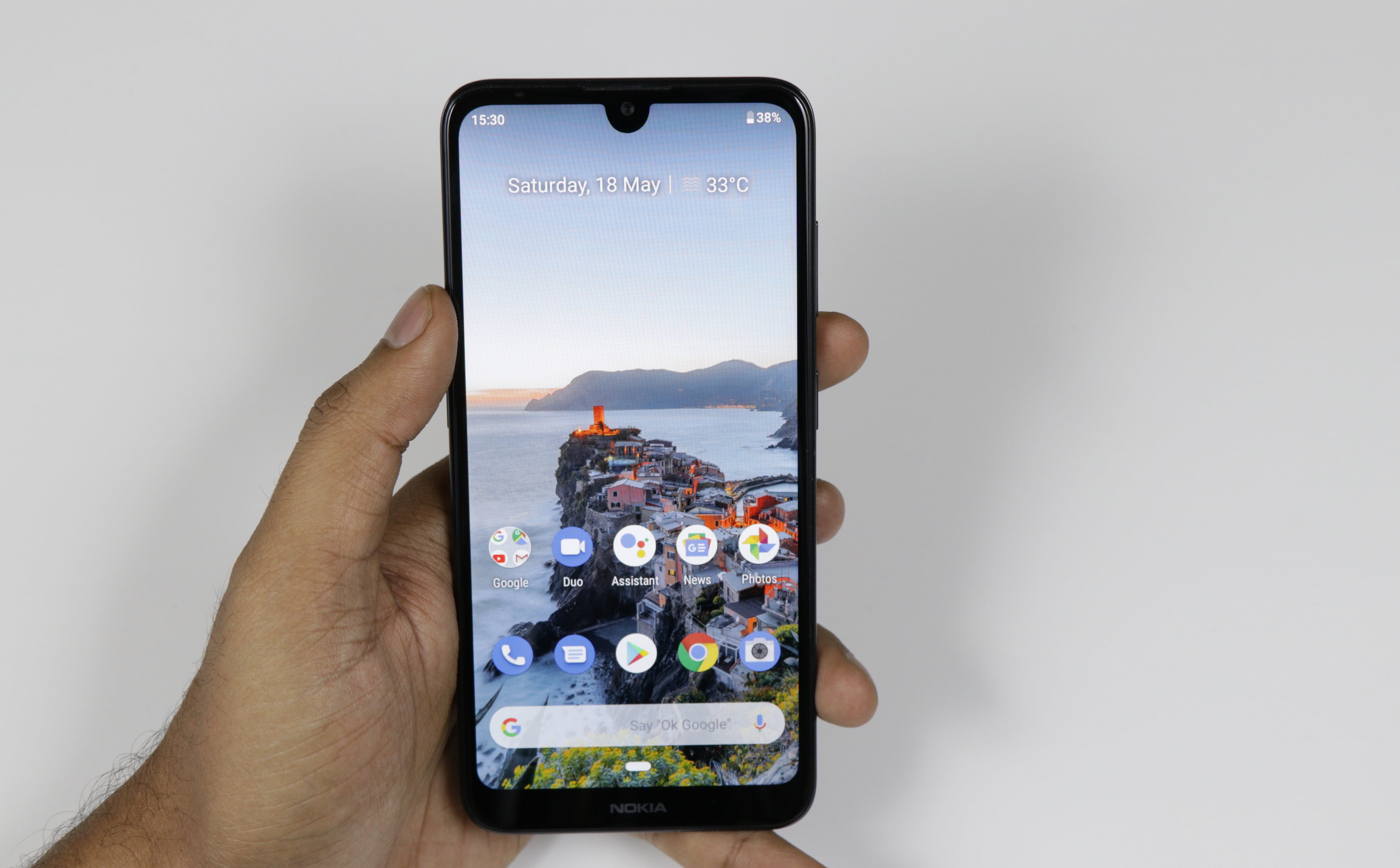 The Nokia 3.2 comes with a selfie notch display measuring 6.26-inch HD+ (720×1520 pixels) with a 19:9 aspect ratio. It’s powered by a modest Quad-core Snapdragon 429 processor, which is a lot disappointing on the company`s part as all the rivals pack a more powerful Snapdragon 660.
Nokia touts the larger display is deemed to entice the user with enough real-estate to fulfil an ever-increasing media consumption, but a screen resolution of 269ppi looks all the more counter-intuitive. It lacks the Widevine L1 certification, which helps the device stream HD content such as Netflix. The screen lacks the needed sharpness and colours too looks pale and boring to look at.
The absence of a powerful processor makes the basic app work feel sluggish. The stock OS feels alright but the device struggles to make even the system app feels fluid. The phone suffered through occasional lag here and there and games was almost unplayable, so we would recommend refraining this phone as it doesn’t seem to be a workhorse of any sort.
The phone has an ambient light sensor, proximity sensor, and accelerometer. A Qualcomm aptX audio codec support, ensure high-quality audio over wireless headphones.
Camera
Cameras include a 13MP rear camera, f/2.2 aperture, 1.12um pixel size and a 5MP front-facing camera. This setup works good for the most part but doesn’t seem to outshine the rivals. The camera app is basic at best due to its association with Android One project but lacks the features such as bokeh mode, AR stickers, portrait light effects.
The camera performance is average as the images look great under sufficient sunlight, but falls short when the light decreases. The pictures look grainy and suffer from a lot of noise in the low light conditions. Indoor photos also looked decent and can be used on social media.
HDR mode worked well to brighten the shots and render the colours we were looking to get. Lack of a stabilizing method makes the video stutter and shake violently.
Battery
The battery remains the key aspect of Nokia 3.2 as the device claims to provide a whole day worth of use age. This claim is bolstered by its everlasting 4000mAh battery unit which gave us an on-screen time of around 10 hours on a full charge with 30 per cent to spare. Charging this battery is a task as it doesn’t get the quick charge treatment of any sort.
Security wise the device looks promising with its fingerprint sensor, but it’s only given to the 3GB RAM variant. It feels snappy and worked quite well as we found under our in house testing.
Gizmo Verdict
The Nokia 3.2 is a decent attempt by the company as it ticks all the right boxes for all its worth. HMD could have worked with the pricing and could easily have opted for a Snapdragon 600 series for the given price.
None the less it is a worth device for the price which gives the assurance level of the reverent brand within a package that could easily fulfil the allotted tasks of an average user.

