Nokia smartphones recently announced it’s budget offering called the Nokia 4.2 in India. This launch highlights the fact that the company will need some considerable time to understand the Indian market that is colloquially dominated by Chinese OEMs, which in-turn means slashing down on prices for their smartphones.
If Nokia manages to trade-off the price aspect while keeping its best attributes, it might just revitalize its long-held legacy in terms of faith that users have in the brand.
Coming back to the launch, let’s explore how swiftly does Nokia plan to enter the budget-friendly territory.
Design
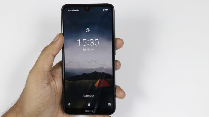
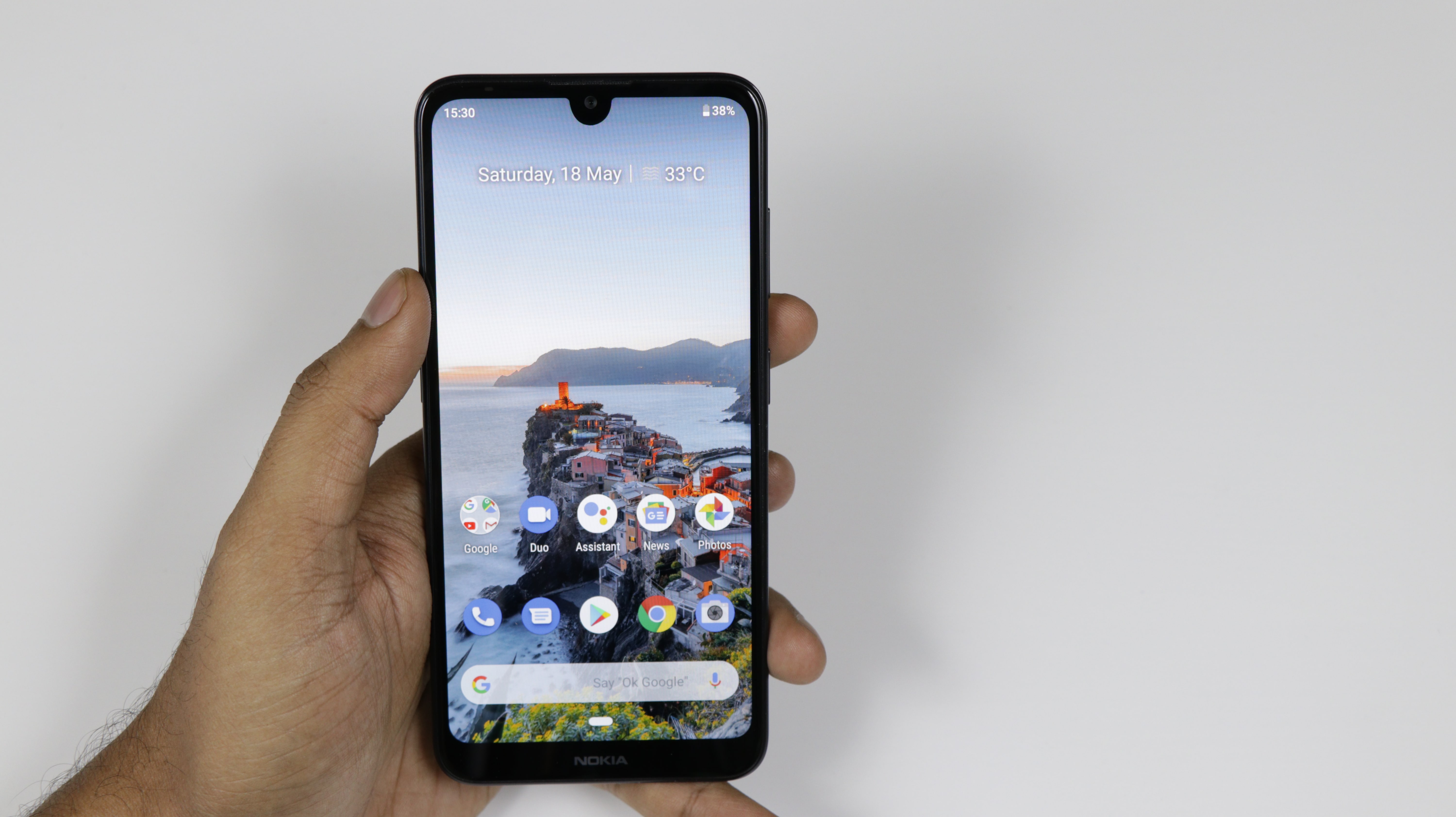
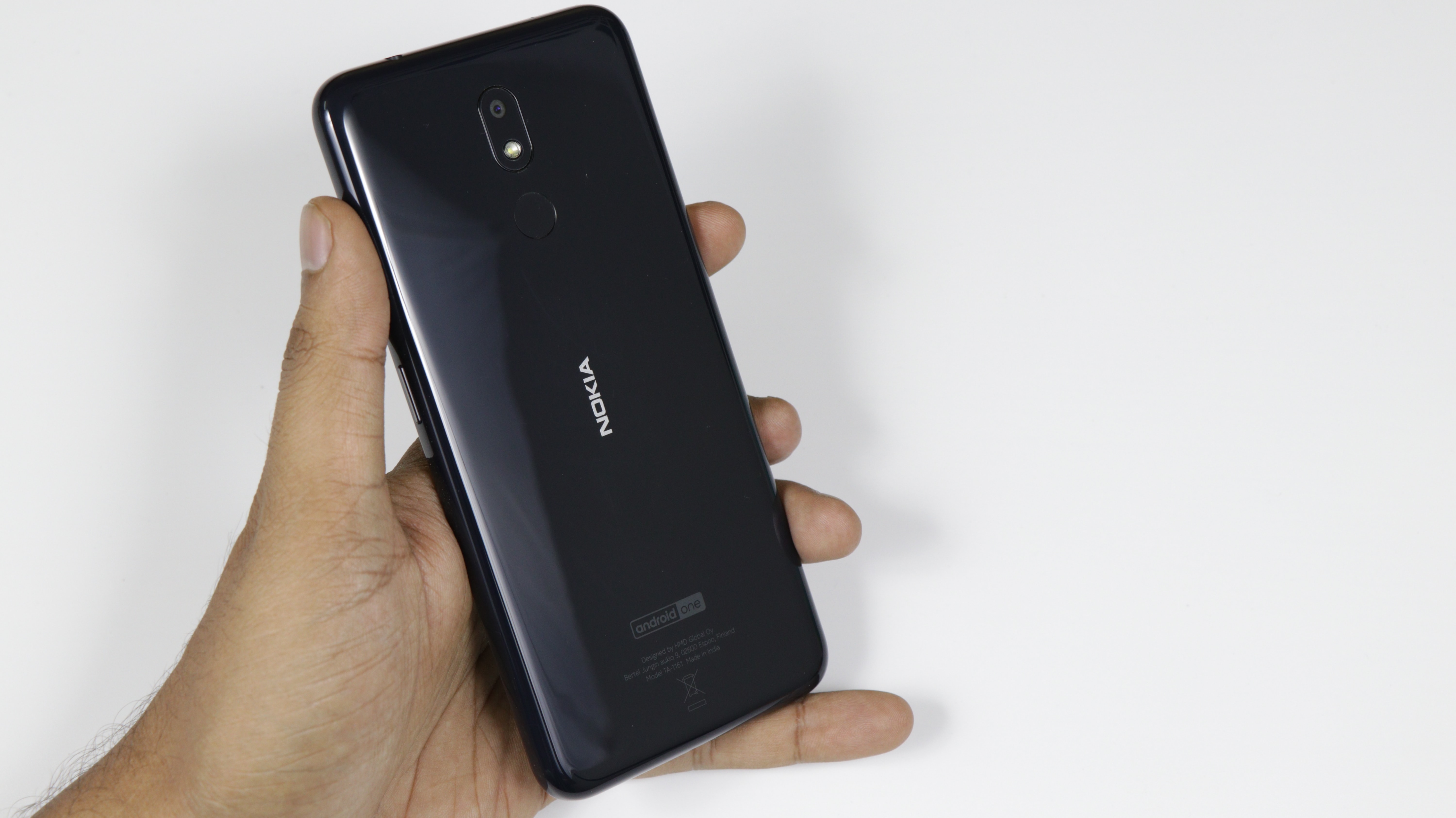
HMD global has a winner up their sleeves as the brand Nokia is known for its design and built quality across the world. That too can be said about the Nokia 4.2 as it represents a whole new range of what Nokia calls to be a new and improved design philosophy. As the competitors beef up the spec sheet, Nokia has taken a radical approach towards a new class of design that trades specs for a high grade of quality finish.
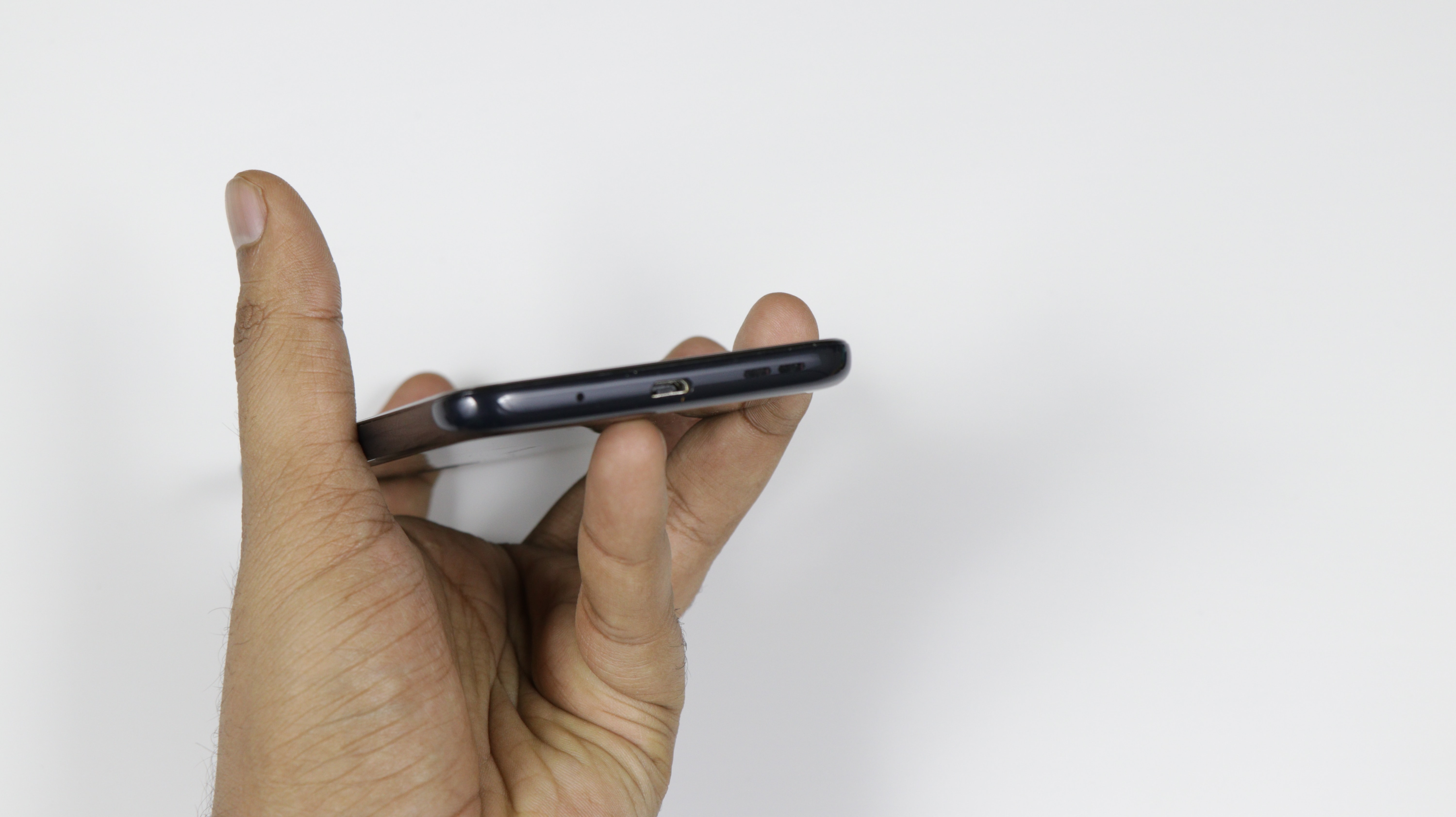
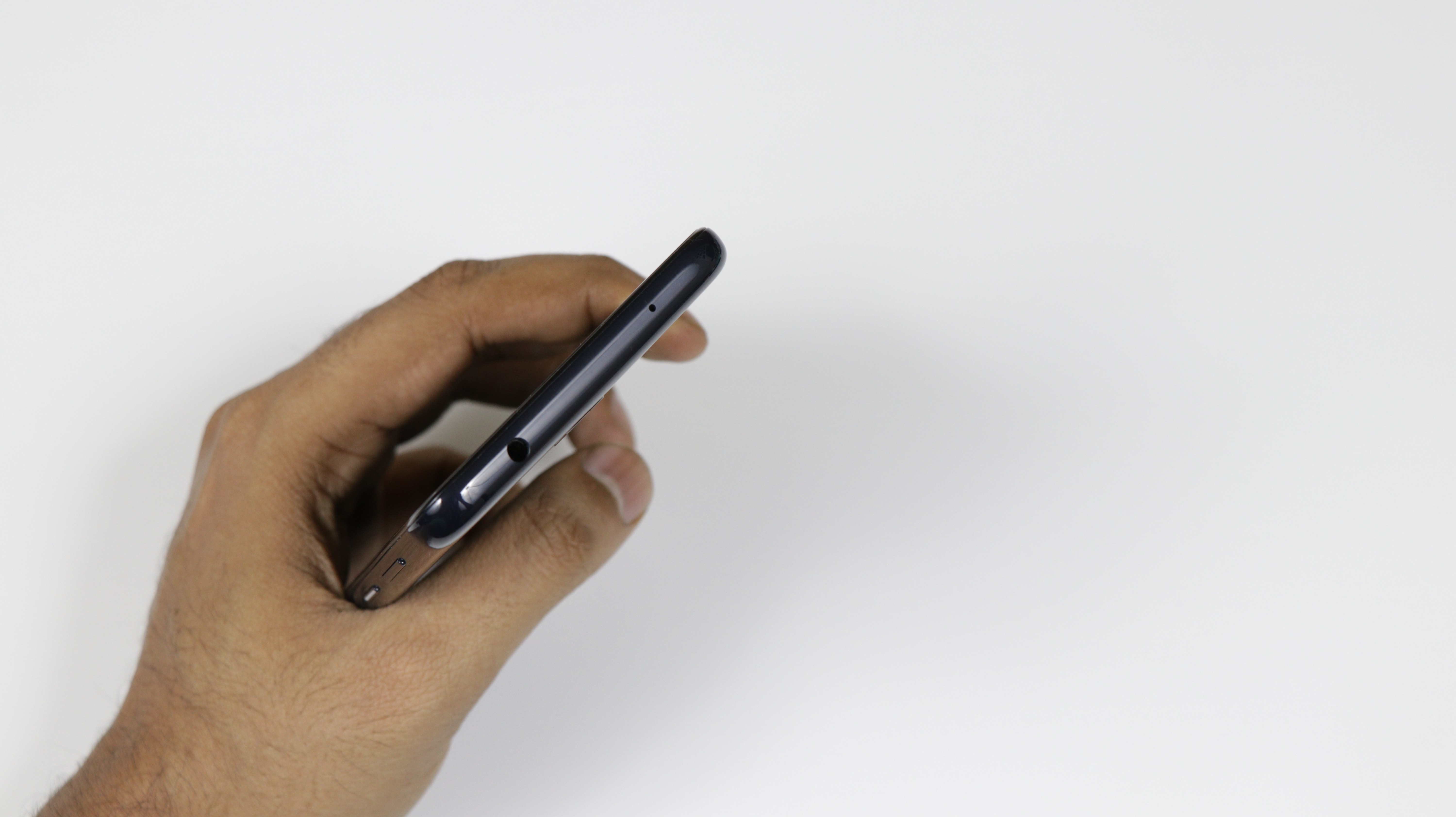
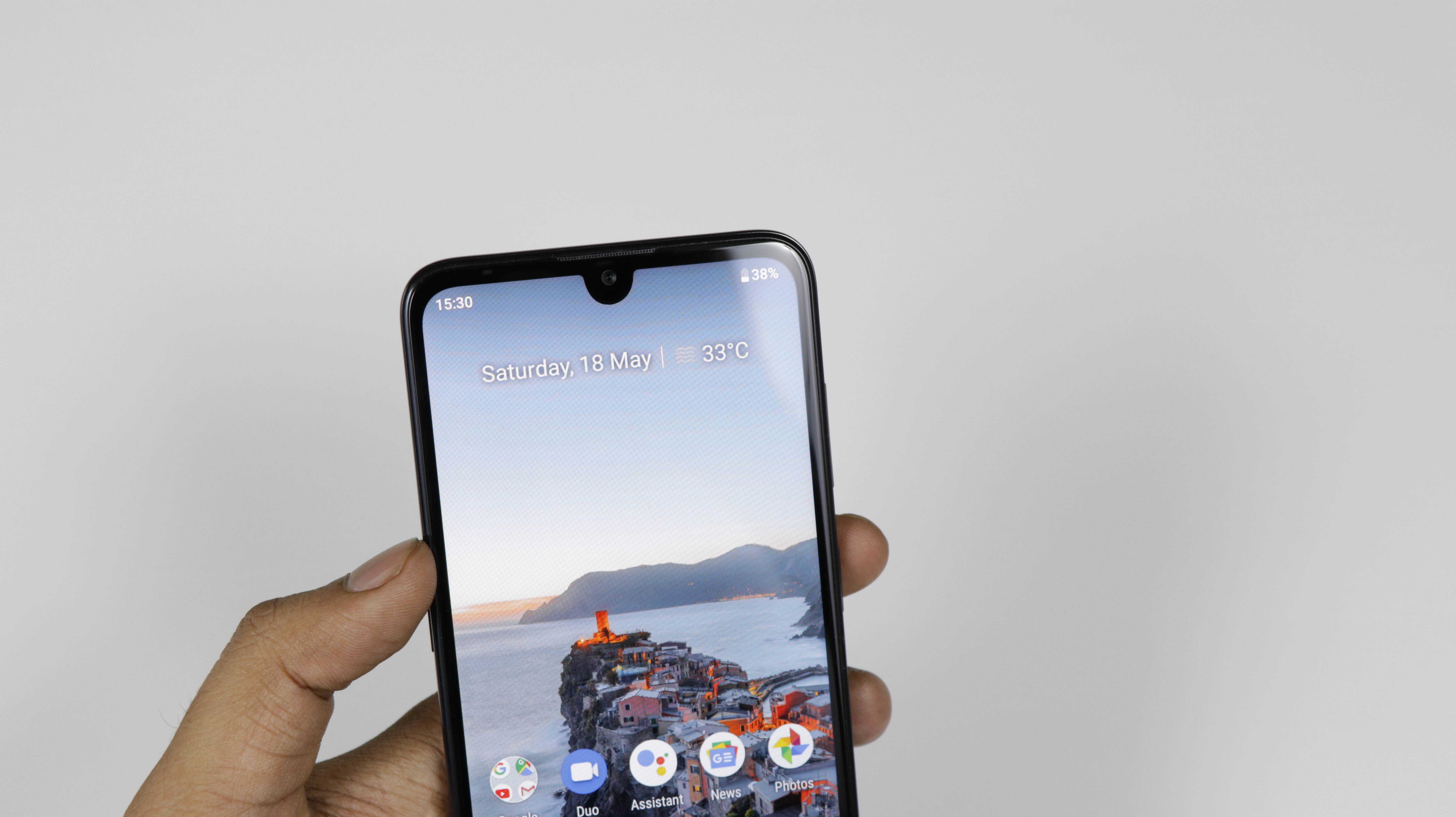
We can attest to the fact that this is quite an elegant way to go forward, as the design of the 4.2 looks creative and mesmerizing at the same time. The smooth glass back that we saw in Nokia 6.1 and 7.1 makes its way here within a teardrop design that flaunts the 5.7-inch (1250x 720 px) screen that weights in at just 161g.
Software
The minimalistic stock Android UI makes up for a fabulous experience that is lag free and smooth. The absence of useless bloatware is quite satisfying as the phone seems untouched and personal at the same time. The fact that this device is part of the Android One Project just makes this device sustainable for a few years by timely security patches and newer Android upgrades.
Performance
For the changes done in the design department, it does cut some slack in terms of the raw power that was necessary for this device. That being said, the Qualcomm Snapdragon 439 Octa-Core chipset coupled with a 3GB of RAM and 32GB of internal storage does perform well for day to day use.
Gaming aside the device runs all the social media apps and entertainment apps without any stutter or lag. Multitasking too comes with a breeze as the device strives to keep up with the user’s speed by keeping the apps running in the background.
Battery backup to is pretty decent considering this device packs just 3,000mAh non-removable lithium-ion battery unit. It managed to clock a great standby time of 9 hours on a single charge which should easily get through a normal day.
Absence of fast charging makes the battery charging time close to 2 hours from 9 per cent to a full 100 per cent.
Camera
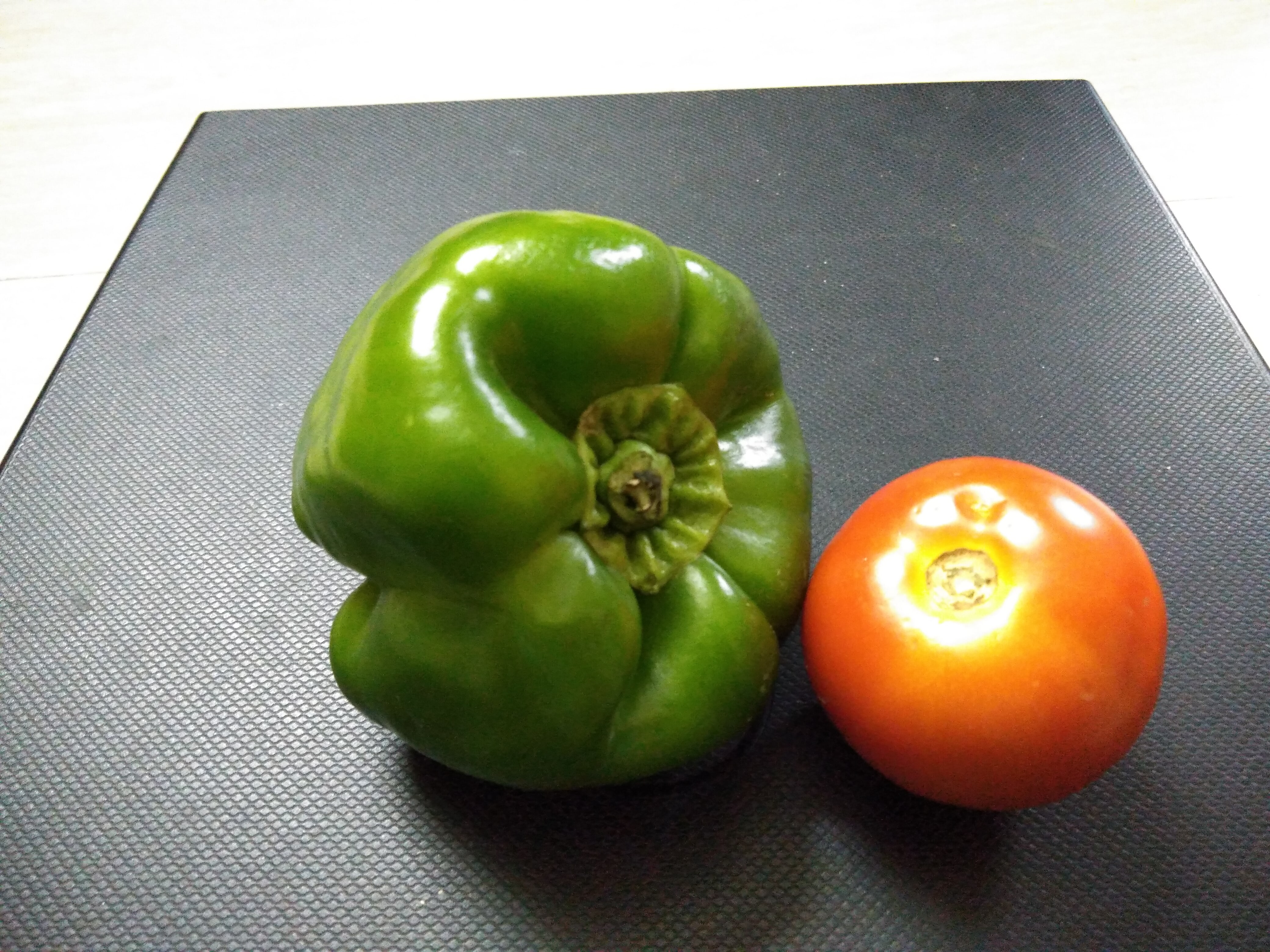
Camera quality is average, as the image quality suffered from background noise and extreme light exposure. The 13MP unit with 2MP depth sensor is just a rudimentary addition which only works under sufficient sunlight. One has to completely stay still to get good shots which were totally absurd.
The Live Bokeh mode manages to delineate the corners from the subject at hand but ends up rendering blurred shaggy images.
The camera app is easy to use but the shutter speed ruins the whole experience as it takes ages to click an image. The front facing 8MP camera too strains itself while capturing selfies.
Features
A nifty little showstopper feature of the 4.2 comes in the form of a power button with integrated notification light which Nokia calls as “breathing” notification LED.
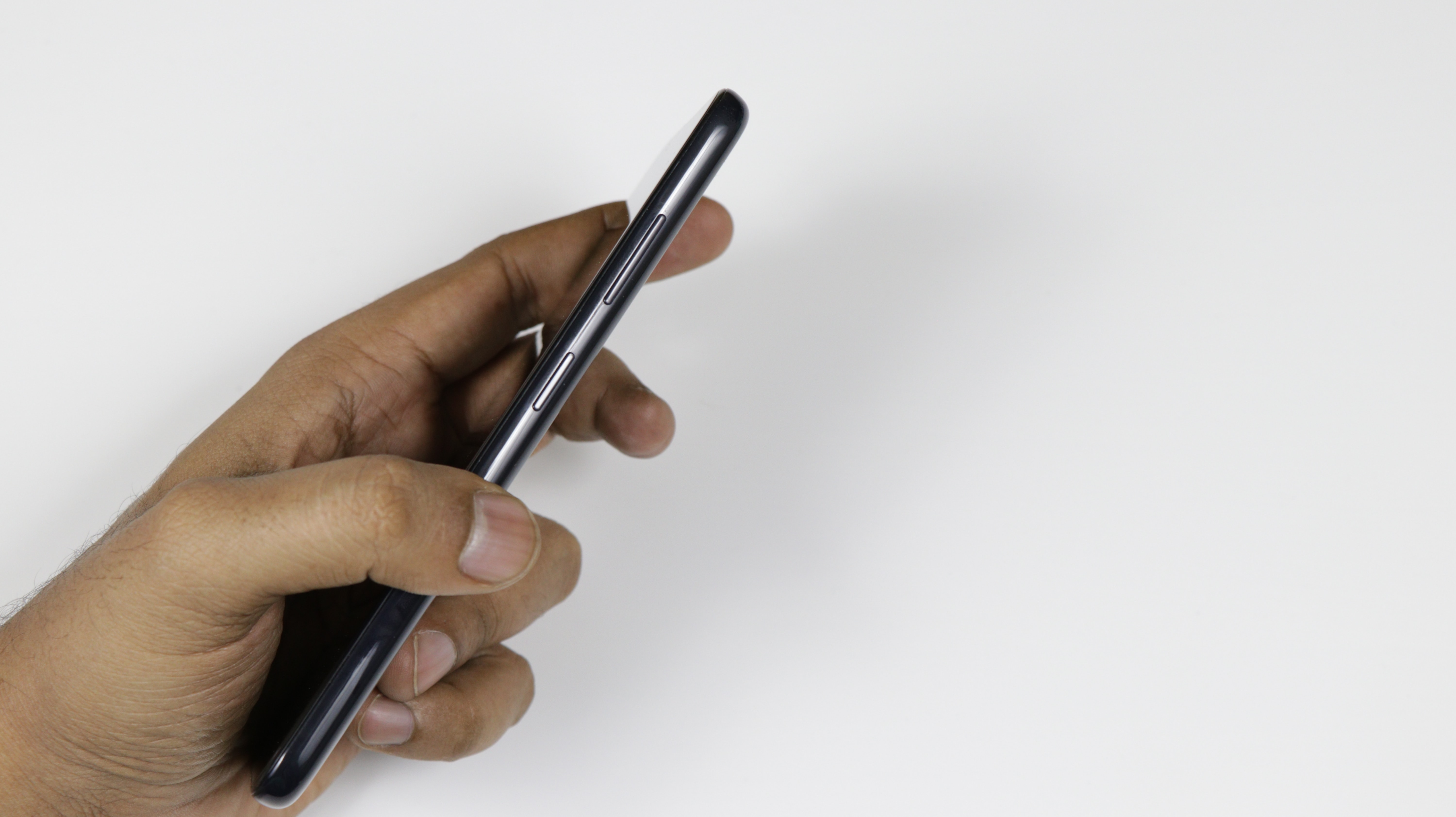
The light pulsates after receiving a notification, however, Nokia should have added the option to use multicolour LED for this purpose to associate it to different apps. There is a Google Assistant dedicated key on the left which fires up the voice assistant at your disposal which is a neat looking feature. pressing it twice takes you straight to Google Assistant feed while pressing it thrice will take you to the Google Assistant feed and awaits your verbal command.
Gizmo Verdict
Nokia 4.2 is a good smartphone at ₹10,990. It works satisfactorily for the given tasks that we through at it. It has its fair share of caveats like a subpar camera, decent battery life, but a gorgeous design makes up for the lost ground. Nokia is on the right path but needs to understand the level of competency needed in this price sensitive market.

